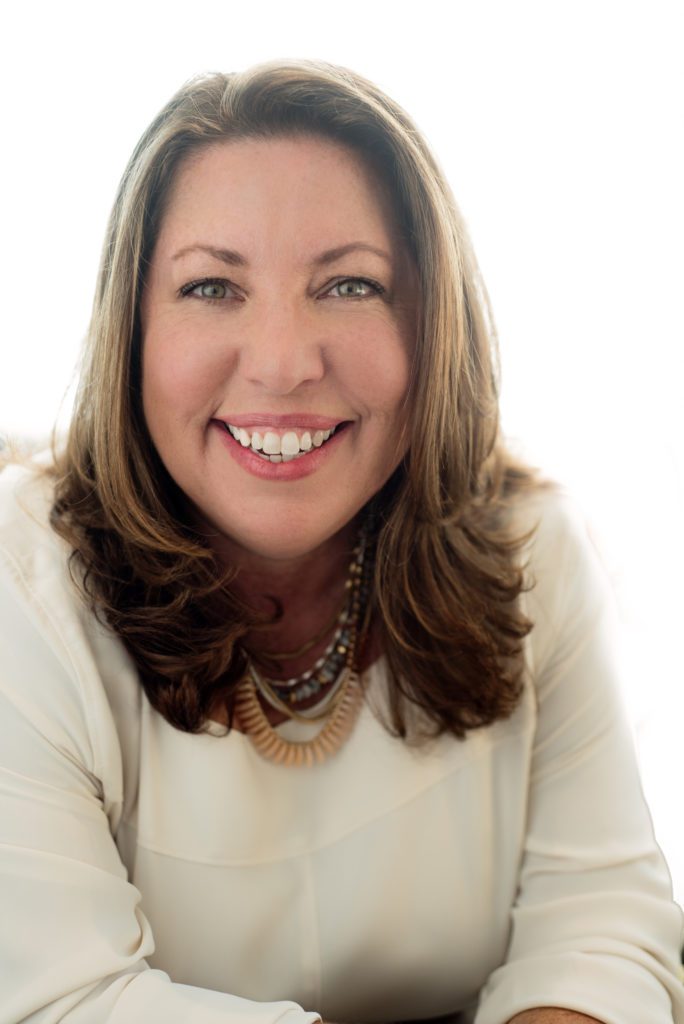
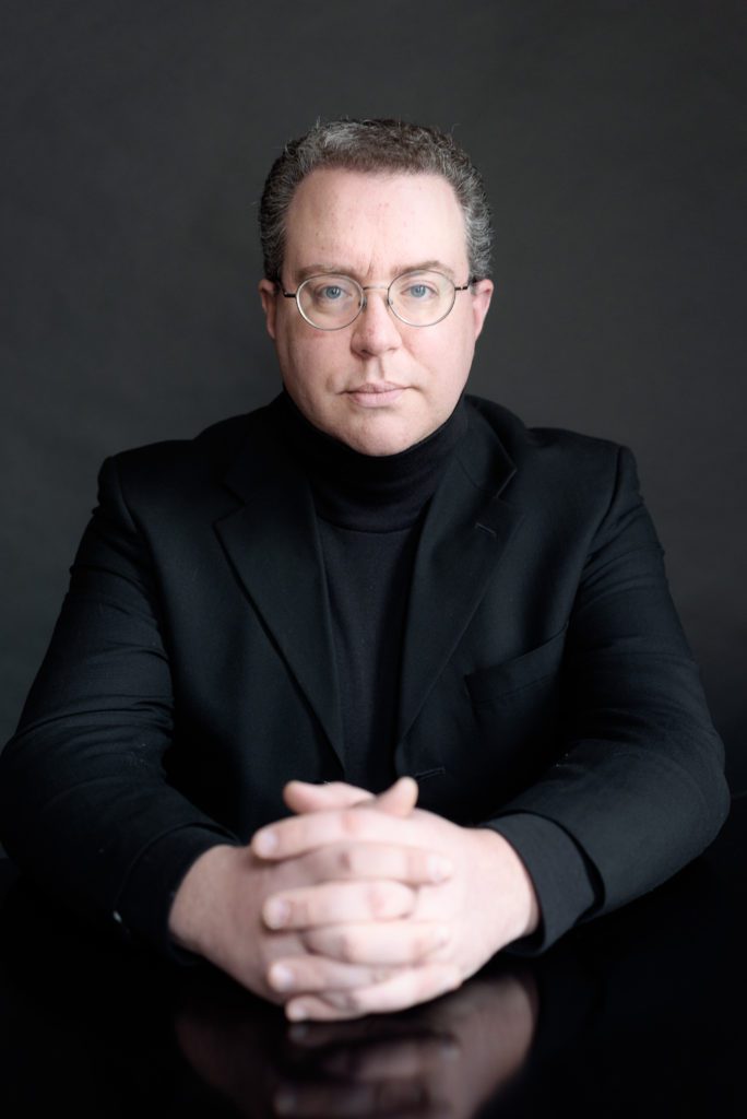
Have a closet full of clothes but nothing to wear for a photoshoot or even an important meeting? Starting with a little color theory can help make that decision a little easier.
Starting with color can narrow down what you have in your wardrobe and help make a conscious decision about what to wear and bring to a photo session. Ever walk into a store and see an outfit on a mannequin that just looks incredible? Well, having 10 years experience in retail at a clothing store I can attest that a lot of that has to do with color. When working with a customer I have seen them try on several items, often just different colors of the same style and there are the ones that work for them and the ones that don’t. Once you are set on a color it is important to think about what the images are going to be used for; Personal Branding Portrait, Family Portraits that can coordinate with the decor of a room, or just a simple portrait that really shows off you. Here are some recommendations on how to choose the colors you want to wear and how it may be perceived in a portrait.
Your Color
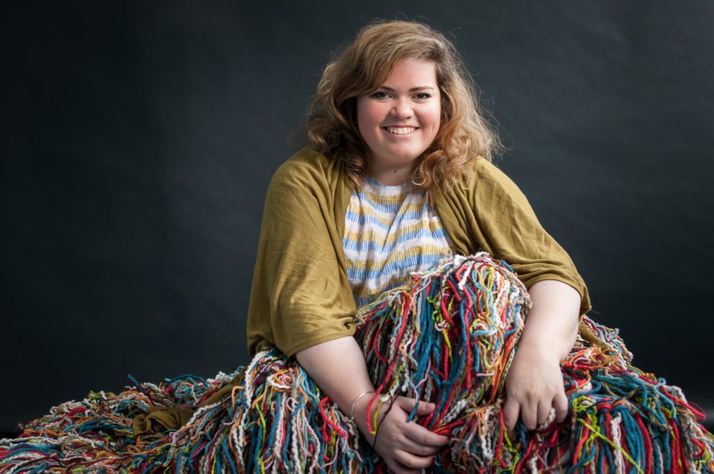
Everyone has “their color,” you know the one that others always compliments about looking great in. For me, it is earth tones and cool colors. Because of my red hair, oranges and reds can sometimes clash with my hair color so I tend to avoid those. Whatever “your color” may be, start with that, or at least your favorite color. Don’t know what “your color” is, or can’t pick a favorite, check out this Lifehacker article.
Neutrals
Adding neutrals to your base color will give you a color palette that can make your choice color pop. Blacks, browns, tans, whites, and grays are compliments and can be incorporated into layers, accessories, or in a subtle pattern. With the addition of the neutral, your color is still present but toned down.
If you are preparing for a family photoshoot you can coordinate colors amongst the family. Dad can have more neutral shirt while the children have brighter colors.
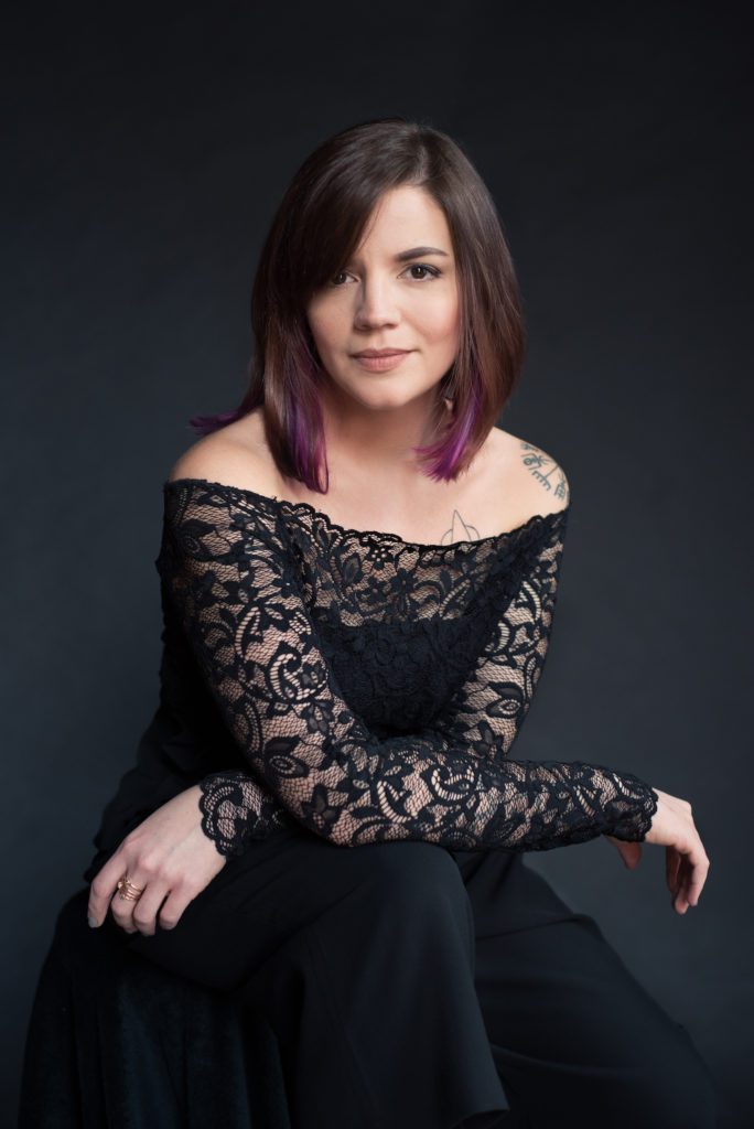
Monochromatic
This look is seen in a lot of magazines and can be very high fashion and editorial vibe. Matching the clothing to the background really separates your face from any distracting elements. It also has a high-end magazine feel.
Color says a lot
They say a picture is worth a thousand words. Well, it can and you can control how it may speak to someone viewing it with these color theory concepts. Colors have a certain mood they give off. Red can give off a sense of power, or passion. Blue is calming and serene. Each color can feel different to everyone but they can affect your portrait. Here is an article I found that goes through each color and the emotions that it can bring up. I find it fascinating. I’m sure there is a rabbit hole of articles relating to this topic, where a simple google search will bring up much more.
Wearing branding colors can really create a cohesive, a cohesive look to your website and marketing materials. Check out the post about Fiona Seabell who incorporated her branding colors and a little more of her personality.
Next time you have trouble picking out what to wear. Think about what emotion you want to portray and then start with color. This can work to your advantage if you are interviewing for a new job or have a meeting where you are in charge. As part of your full session, I am happy to provide clothing tips and thoughts, even as far as bouncing pictures back and forth.